
Medicare Advantage Shopping
A lot of users were shopping for plans, but very few were taking the next step of enrolling in the plans they found and it was because most never identified the plan that fit them best.

As an independent insurance marketplace users loved that we were not affiliated with a specific insurance carrier and could show them all of the plans available in their area, but presenting all of the plans the way we were wasn’t helping users narrow their search easily enough.
Problem:
Users struggle to shop for and enroll in insurance plans due to a difficult digital experience. There's an opportunity to design a better experience that empowers them to complete enrollment independently and successfully.
Goals:
Increase overall online conversion of insurance plan shopping and enrollment by:
- Reducing drop-off across the shopping and enrollment journey
- Better enable users to find, compare, and enroll in a plan that fits their needs—confidently and independently.
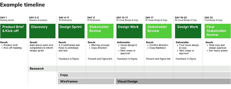
Product Discovery & Design
Starting the discovery process we wanted to collect as much quantitative and qualitative data as possible. We needed to better understand what users were doing on the site in it’s current state, what was working and what wasn’t. We knew we couldn’t constrain ourselves to just tinkering around the edges.
Discovery included:
- Working with the Data Analytics team to review visitor data (engagement, drop-off, page navigation)
- Review hours of user screen recording
- Competitive analysis of other insurance shopping experiences
- User research on our existing site and competitor sites
- 30+ participants across multiple studies
- User personas
- Prioritized list of insights, opportunities, and hypothesis
Design:
- Using the information we collected in discovery we set out to designing and prototyping new user experiences
- Concept testing with users
- Revising and retesting
Focus Areas:
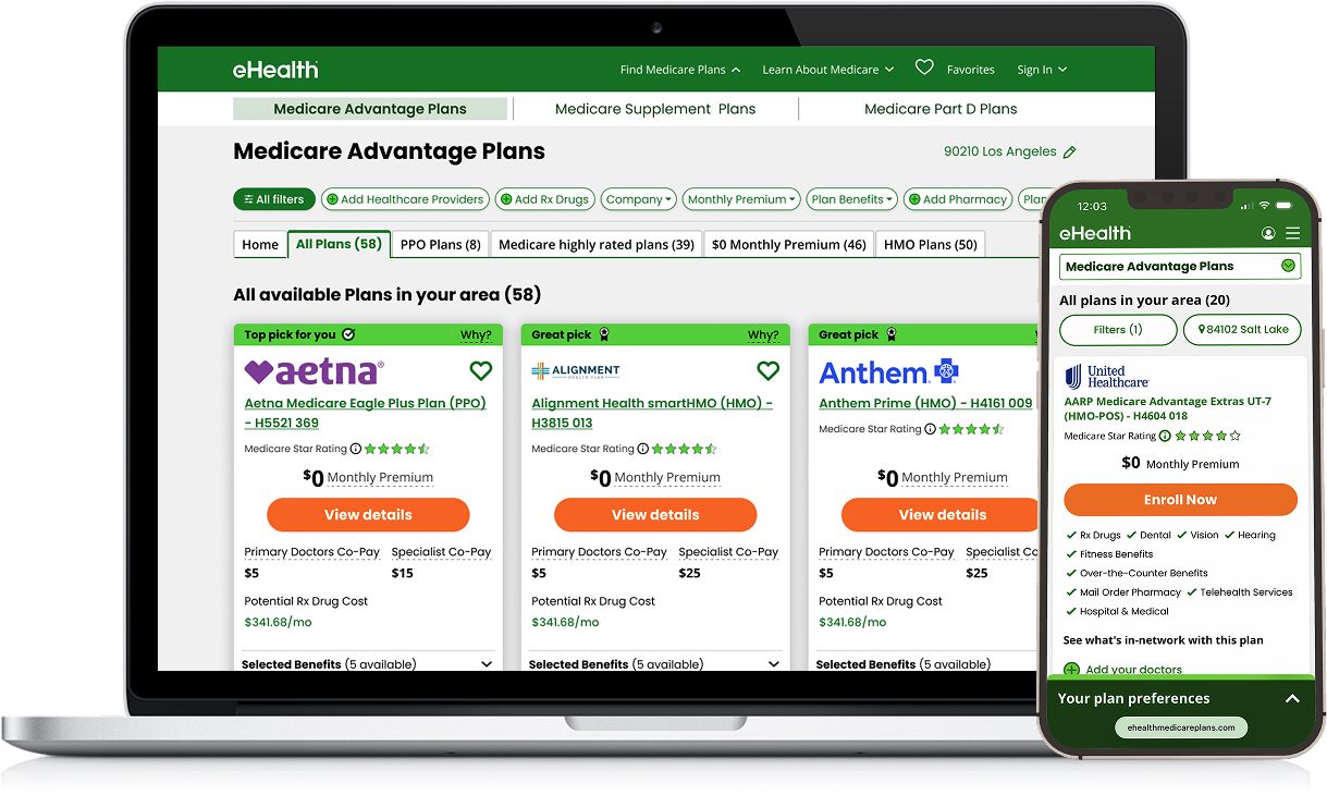
- Usability improvements: Filters, page layout, plan card
- Filters and pre-filter tabs: Optimizing labeling, order, and tabs for popular criteria
- Mobile optimized UX
Core Idea:
- Improve discoverability
- Narrow results quickly
- Simplify plan info
- Side-by-side card design
Why this works:
- Users engage with filters when they're easy to find.
- Adding doctors and drugs anchors plans to what users actually care about.
- Fewer plans to consider lowers cognitive load — and lifts completion.
Results
We able to vastly improve the user experience, reducing friction throughout the users journey that enabled them to better engage important features that allowed them more quickly find insurance plans that met their needs and dramatically improved overall conversion.

Not only did we get amazing improvements in overall conversion, we also improved 90 day retention in the process.